Lesson Two : Analyzing Radio Data
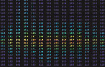
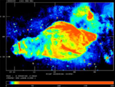
A radio telescope is like a one-pixel camera capable of recording only the intensity in the direction the telescope is pointed. If you point a radio telescope at different locations while measuring voltages, you can map out the intensity of the sky, one “radio pixel” at a time.Since radio waves are not visible, it is difficult to create comprehensible images of radio sources. Images from radio observations are often depicted as contour maps, resembling topographical maps. Astronomers assign different colors to the different levels of measured intensity. More intense radio sources release more energy. These high intensity sources correspond to the brighter colors on a radio map (with yellow and white representing the most intense sources). Less intense sources have a lower energy and correspond to cooler colors (usually blue) on the radio map. By creating maps of radio sources we can observe their size and structure.
Radio intensities plotted by numbers


Radio Map: most intense radiation is in red, least intense is in black/blue.

This image was generated with data from telescopes of the National Radio Astronomy Observatory, a National Science Foundation Facility, managed by Associated Universities. Inc.

This image was generated with data from telescopes of the National Radio Astronomy Observatory, a National Science Foundation Facility, managed by Associated Universities. Inc.